Saturday, September 29, 2007

Secret Artworks - Show

Secret ArtWorks is an annual fundraiser for ArtWorks. Local, national and internationally acclaimed artists are invited to create 5”x7” Secret Works of Art. The secret is the identity of each artist, which remains unknown until the work of art is bought and the signature is revealed on the back. 100% of the proceeds from Secret ArtWorks support ArtWorks programming for Apprentice and Professional Artists involved in ArtWorks.

November 15, 2007 @ 6pm in the Westin Hotel Fountain Room.

Learn more over on their website: Secret Artworks.

Friday, September 28, 2007

BFK from Daniel Smith

(from Andrea)

Hey everyone,
I just ordered 200 sheets of BFK from Daniel Smith at $2.00 a sheet with no shipping charge for my classes. If you want me to order more for you, let me know. I would need to get the order up to 100 sheets to get the discount price.
Andrea

Dolphin Paper in Indianapolis

I just ordered from Dolphin Papers in Indianapolis. I ordered over the phone, and they were very nice there. They also rolled the paper and packaged it very well, so that there was no crazy oversize shipping charge. It arrived in pristine condition, very fast. Their prices are good, and I definitely suggest using them. You can check out some stuff on their website: paperforart.info.

The image provided here was snagged from their website.

(They carry decorative papers, printmaking papers, and also that Mohawk Superfine Text paper we used for bookbinding! I just got some white & smooth. It's delish!)

xox
nicci

Local Art Blog - Sara Pearce

Sara Pearce's Art Blog over on cincinnati.com is a useful source for all things local. She lists shows, provides some images info, announces lectures and opportunities (including calls for art). You can find the link at any time from this blog. Just look over to the bar on the right, and scroll down to the Local Hot Spots & News section to find this link if you misplace it in the future:

http://frontier.cincinnati.com/blogs/art/

That said, if anyone's going to the Lightbourne Lecture Oct 10 @ 7pm over @ CAM, I will see you there!

The picture of Sara was snagged from her blog! And go check out the show up in the NKU Galleries right now. I hear it's neato.

xox
nicci

Thursday, September 13, 2007

Letterpress Exhibition + Lecture

Northern Kentucky University | Department of Visual Arts | Nunn Drive | Highland Heights, KY 41099

Opening reception } September 27, 6 — 8 pm } Fine Arts Center, Main and Third Floor Galleries

With a public lecture by Jim Sherraden } September 27, 7:30 pm } University Center, Budig Theater

Tuesday, September 11, 2007

Printed By Hand - Show Announcement

An exhibition of original prints by:
Suzanne Chouteau, Rick Finn, April Foster, Saad Ghosn, Karla Hackenmiller, Terence Hammonds, Kevin Harris, Brian H. Jones, Katherine Kadish, Donald Kelley, Andrea Knarr, Theresa Kuhr, Craig Lloyd, Mary Mark, Mark Patsfall, Ellen Price, Thom Shaw, Alison Shepard, Sherry Sicking, Jon Swindler, Jim Williams, & Elaine Mullen Zumeta.

University Galleries on Sycamore
628 Sycamore Street
Cincinnati, Ohio


Opening Reception: Friday September 28, 2007, 5-8pm

Hours: 12-5 Tues-Fri; 12-4 Saturdays
Phone: 513-241-1400

Tax Free and Easy

Everyone, if you use enough frames and do enough business to have a tax number (even if you don't!), it is really easy. Then you can use Frame King . Just get form 10A100-FI(6-05) from the Commonwealth of Kentucky, Department of Revenue, P.O. Box 299, Station 20, Frankfort, KY 40602-0299, (502) 564-3306, or go to:
www.revenue.ky.gov and download the form. You will have to file for a few months on a monthly basis and then they go to a semi-annual basis.
The filing is easy too.


Penny

Paper Site

Several people at the workshop Saturday asked where I got the paper I was using, so here's the site -- they have a huge selection, and their inventory is searchable by color, which is a nice feature. The black paper with newspaper bits included can be found by searching for all their selections in black...and so on. They are really nice to deal with and often include extra samples when you order from them. Enjoy!

Kathleen

http://handmade-paper.us/

Monday, September 10, 2007

Kathleen's Book

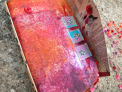
Kathleen (Piecefield) created this book in the workshop led by Jennifer D. Anderson @ NKU this past Saturday.

Artists who attended the workshop made books of roughly the same dimensions, using various papers and embellishments on their books. When closed, most of our books measured approximately 9.5 x 13 x 1 inches.

Kathleen writes: "I finished the book with a little toggle made from a sliver of driftwood, and added a braided linen tie to wrap around it, which shows up in the detail shot. I am really loving the weight and flexibility of this book-- how good it feels in the hand! I like the smell of the new paper, and it even makes a pleasing sound....so it is engaging all the senses!"

This image is a detail of Kathleen's book--the toggle closure she mentioned in her comments. I think it's pretty sexy, and it is characteristic of her work, with a natural inclusion, and a certain elegance.

I would love to see this and other books in person. I hope we can all get together sometime in the near(ish) future to pass our books around and see what everyone has done with theirs. Posting them here, of course, is the next best thing!

Note: If you attended the workshop, and you would like to have us post your work here in the Edition Varies blog, please feel free to send the photo and any writing/description/comments you have about your work to Nicci.

Bookbinding Workshop at NKU


Photographs taken at the Bookbinding Workshop taught by Jennifer Anderson at Northern Kentucky University on Saturday, September 8, 2007

Sunday, September 9, 2007

artist book - star - a peek inside


artist book - star - a peek inside
Originally uploaded by anongrrl


wasn't our workshop with jennifer cool? i had a lot of fun, even if i was pretty slap happy from lack of sleep. sometimes it just makes glue mishaps that much more amusing, right?

right.

anywho, i haven't finished my big orange sketchbook-thing get, but today i made a smaller book, which measures about 7.5 x 4.75 x 1 inch, with the same technique. you can poke around the guts, so to speak, if you click on over to my flickr set on this book, or go see what it looks like closed.

you can also see a little sneak peek at the spine of the orange book. gasp! it's finished, i swear! once it's embellished, i'll post it here.

i was concentrating so hard on keeping glue out of my hair, that i really didn't take a lot of workshop progress photos. i know randel did, so i leave it to him to post some here!

Tuesday, September 4, 2007

Pressing Print

Pressing print

Modern-day Gutenbergs are raising lettering's profile, reviving the tactile craft of letterpress.

By Kellie Patrick Gates
For The Inquirer
Ryan Howell, at his 100-year-old press at Mad Maude in Kensington, sees letterpress as a rebellion against electronic printing.
JOHN COSTELLO / Inquirer Staff Photographer
Ryan Howell, at his 100-year-old press at Mad Maude in Kensington, sees letterpress as a rebellion against electronic printing.


Bathed in late-day light pouring through the windows of a former textile mill in Kensington, Ryan Howell spreads thick, gooey ink onto a round metal plate.

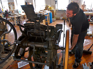
He slips a piece of thick paper into the maw of one of the 3-foot machines that girlfriend and artistic partner Leslie Graham calls "the monsters." He flips a switch and pulls a lever. The monster groans, then spits out a highly detailed print of the Frankford Armory.

Howell, 24, and Graham, 25, have discovered an old method of printing called letterpress. The name comes from the act of pressing letters - or in this case, a metal photo engraving of an ink drawing - onto paper.

At a time when so much communication is electronic, a growing number of print artists, and buyers of printed materials, are saying no to the computerized and yes to this more tactile form.

"I want to create stuff in low volume that people will want to keep for 100 years," said Howell, who started Mad Maude Press in September with Graham. "I like that it's manual. I like that there aren't any rules. And I like that every time you do a new job, you have to figure something out."

The increased popularity of letterpress echoes the arts and crafts movement of the late 19th and early 20th centuries, when many rebelled against mass-produced goods in favor of the handmade.

One of Howell and Graham's recent jobs was printing bookmarks for the Book Trader in Old City and Herridge Books in Wellfleet on Cape Cod. When Howell first approached Peter Hiler, who owns both stores, with an offer to beat the price he was paying for bookmarks, Hiler agreed for the cost savings.

But then Howell mentioned letterpress, and Hiler was sold.

"It's like with Stickley making his chairs," Hiler said. "He takes such care to do it, and anybody who takes such care now is a hero to me. He's bucking the system."

The bookmarks show a man under a tree, looking out over water and clouds. The clouds pop out from the background. Run a hand over the lettering, and the indentations are obvious even with eyes closed.

"You can feel the three-dimensional quality of it," Hiler said.

Letterpress is actually much more tactile now than it's ever been. When letterpress was in wide use commercially, printers took care to get the ink on the paper without allowing the metal plate to leave a mark.

"You wanted to 'kiss' the paper, not 'sock' it," said Mary Phelan, director of the printmaking/book arts program at the University of the Arts.

Now both artists and aficionados are often after the "socked" look. This is partly the artistic and aesthetic preference among those who have newly discovered this kind of printing, Phelan said, and partly a desire to make sure anyone who sees the printed object will know without a doubt that they are looking at letterpress.

Phelan sees evidence of the letterpress resurgence in the printmaking/book arts programs' enrollment. In the last three years or so, the graduate program jumped from 14 to 20 students and the undergrad from 23 to 32, she said.

Letterpress has a glorious past. It's how Gutenberg made his Bibles in the 14th century. Before then, every copy of a book had to be written by hand.

Letterpress helped spread not only the words of the Gospels, but also the words of many social and political movements, said Mike Denker, a hobbyist printer who is president of the Chesapeake chapter of the American Printing History Association. Benjamin Franklin's Pennsylvania Gazette was printed with letterpress.

Technological advances speeded up letterpress in the 1800s, and newspapers and magazines could circulate widely. They continued to be printed with letterpress until the 1970s, when offset lithography became the printing norm.

Offset is done with computers. No one needs to set plates letter by letter. It's faster. It's cheaper. And it temporarily shoved letterpress printing to the wayside.

"It's all driven by economics," Denker said.

Phelan, of the University of the Arts, said letterpress never completely went away. Even though most books and other publications are done with offset printing, letterpress has been used in fine printing and some literary publishing.

The University of the Arts has offered undergraduate classes since the 1960s. The Vandercook presses it uses are mostly from the World War II era; until three or four years ago, a press could be had for a few hundred dollars, Phelan said.

One price of the resurgence: "They're now up to $3,000 to $4,000."

University of the Arts student Regan Gradet, 34, is a second-year master of fine arts student in the printmaking/book arts program.

She worked 12 years as a graphic designer in San Francisco and New York before becoming a student again.

"I missed working with my hands," she said.

Gradet was recently binding her first book, The Cynic: Part 116. It's a deconstruction of Shakespeare's Sonnet 116. Each page has the whole sonnet printed, with all but a few words covered up. The words change from page to page, and the result is a simple story of one person's journey from pessimist to romantic optimist.

Gradet chose to do much of the printing with letterpress.

"Letterpress feels more real," she said. "I feel like the resurgence of letterpress and other things that are crafts, like knitting and quilting, are a reaction to the growth of digital media. I think it is a backlash."

The backlash has hit the incredible economic engine known as the wedding industry.

Brides have a lot of market power, and more and more brides want their wedding invitations, thank-you cards and the like to be letterpress printed instead of engraved, said Megan Kuntze, senior marketing manager at Crane & Co.

The stationery company has been around for 200 years. It introduced letterpress in 2004, in response to customer demand, Kuntze said. There's been double-digit growth in sales every year since, she said.

"The wedding category is tops for us as far as usage," she said. "Baby is second. But we've also introduced letterpress as box stationery, initial notes."

The additional labor involved with letterpress means it is not cheap. Those initial sets are the most affordable letterpress item Crane offers, 10 cards and 10 envelopes for $15. Personalized stationery starts at about $200 for 50 cards and envelopes. Wedding invitations are more like $500, Kuntze said.

Not all letterpress is done with handset letters and hand-carved plates. In a blend of old and new, computers are used to create elaborate designs, incorporate modern typefaces, and allow the printing of letters that are not confined to straight rows.

Graham and Howell are using that technique, but they still use old-fashioned, hand-set lead type. They have found old plates at flea markets. And Graham also painstakingly carves images into linoleum.

Both Howell, who studied writing and advertising at Rowan University, and Graham, who studied graphic design at Philadelphia University, have been interested in printing for years. Graham considered going into printing right after college, but a professor discouraged her.

Last summer, Graham and Howell saw letterpresses at the Smithsonian. Then her sister sent her a letterpress birthday card, and she and Howell were both taken with it. "He said, 'We could do that,' and we went online and looked for a press," Graham said. "The next thing you know, we're renting a truck and going to North Jersey."

They found that first press at Briarpress.com, a nationwide online letterpress community, Howell said. Its previous owner: a retired printer in Wall, N.J. They paid about $400. Howell said the presses he uses are not as expensive as the Vandercooks, at least not yet.

The duo started with greeting cards of their own for Valentine's Day. She carved images, he crafted words. One with a blender out front says "We mix well together." Another with naked feet says "You knock my socks off." They sold for $3.50.

Now, greeting-card designs lie in drawers, unprinted, while the Mad Maude creators work on wedding invitations and stationery. Weddings start at $500 for 200 invitations, envelopes and reply cards, Howell said. Custom designs and premium papers cost extra.

Both have day jobs, but head to their former textile mill each evening and on weekends. They put in 40 ink-stained hours a week, have acquired interns and created a Web site (www.madmaude.com), and hope, one day, to live entirely off the love of letterpress.

"It's definitely what I want to do in the long run," Howell said.

Saturday, September 1, 2007

Printmaking Terms

After:
A print is made after an artist if the printmaker copied the image from a drawing or painting by that artist.

À la poupée:
A print is printed in color à la poupée when colored ink is applied directly to a plate's surface and worked into the appropriate area of the design using cotton daubs called dollies, or in French, poupée.

Antique print:
Any print printed and published prior to 1900 is considered an antique print. A modern reproduction of an old print is not itself an antique. The cut-off date of 1900 is not firmly fixed, however, and in many circumstances original prints made before World War II are also considered to be antiques.

Blind stamp:
A blind stamp (also "chop mark") is an embossed seal impressed onto a print as a distinguishing mark by the artist, the publisher, an institution, or a collector.

Block:
A {wood} block is a piece of wood used as a matrix for a print. Wood blocks are used primarily for woodcuts or wood engravings.

Broadsheet (broadside)
An unfolded sheet of paper printed on one side only. A broadside is an advertisement or announcement printed on a broadsheet.

Catalogue raisonné:
A catalogue raisonné is a documentary listing of all the works by an artist which are known at the time of compilation. It should include all essential documentary information.

Chine appliqué (chine collé):
A chine appliqué or chine collé is a print in which the image is impressed onto a thin sheet of China (or other similar) paper which is backed by a stronger, thicker sheet. China paper takes an intaglio impression more easily than regular paper, so chine appliqué prints generally show a richer impression than standard prints. Proof prints are often done as chine appliqués.

Edition:
An edition of a print includes all the impressions published at the same time or as part of the same publishing event. A first edition print is one which was issued with the first published group of impressions. First edition prints are sometimes pre-dated by a proof edition. Editions of a print should be distinguished from states of a print. There can be several states of a print from the same edition, and there can be several editions of a print all with the same state. For limited editions, cf. below.

Fine Art & Historical Prints:
Prints can be separated into two general types, fine art prints and historical prints. These types can best be understood through a differentiation of their emphasis. The distinction between the two types of prints is not clear-cut nor is it understood by all experts in the same way, but generally a fine art print is one conceived and executed by an artist with as much or more concern for the manner of presentation of the print as for its content, whereas the concern of the maker of an historical print is focused more on the content of the image than on its presentation.

Gum arabic:
A secretion of the acacia tree. Used on the surface of some antique hand-colored prints to add depth/texture to the image. Can be seen by holding the print at an angle to the light.

Impression:
An impression is a single piece of paper with an image printed on it from a matrix. The term as applied to prints is used in a manner similar to the term "copy" as applied to a book.

Intaglio:
An intaglio print is one whose image is printed from a recessed design incised or etched into the surface of a plate. In this type of print the ink lies below the surface of the plate and is transferred to the paper under pressure. The printed lines of an intaglio print stand in relief on the paper. Intaglio prints have platemarks.

Lettering or Letterpress:
The lettering of a print refers to the information, usually given below the image, concerning the title, artist, publisher, engraver and other such data.

Limited Edition:
A limited edition print is one in which a limit is placed on the number of impressions pulled in order to create a scarcity of the print. Limited editions are usually numbered and are often signed. Limited editions are a relatively recent development, dating from the late nineteenth century. Earlier prints were limited in the number of their impressions solely by market demand or by the maximum number that could be printed by the medium used. The inherent physical limitations of the print media and the relatively small size of the pre-twentieth century print market meant that non-limited edition prints from before the late nineteenth century were in fact quite limited in number even though not intentionally so. German printmaker Adam von Bartsch, in his 1821 Anleitung zur Kupferstichkunde, estimated the maximum number of quality impressions it was possible to pull using different print media.
  • Engraving: 500 (and about the same number of weaker images)
  • Stipple: 500 (and about the same number of weaker images)
  • Mezzotint: 300 to 400, though the quality suffers after the first 150
  • Aquatint: Less than 200
  • Wood block: Up to 10,000
It was only with the development of lithography and of steel-facing of metal plates in the nineteenth century that tens of thousands of impressions could be pulled without a loss of quality. These technological developments led to the idea of making limited edition prints, by which printmakers created an appearance of rarity and individuality for multiple-impression art.

Matrix:
A matrix is an object upon which a design has been formed and which is then used to make an impression on a piece of paper, thus creating a print. A {wood} block, {metal} plate, or {lithographic} stone can be used as a matrix.

Mixed Method:
A mixed method print is one whose design is created on a single matrix using a variety of printmaking techniques, for example: line engraving, stipple, and etching.

Numbered Print:
A numbered print is one which is part of a limited edition and which has been numbered by hand. The numbering is usually in the form of x/y, where y stands for the total number of impressions in this edition and x represents the specific number of the print. The number of a print always indicates the order in which the prints were numbered, not necessarily the order in which the impressions were pulled. This, together with the fact that later impressions are sometime superior to earlier pulls, means that lower numbers do not generally indicate better quality impressions. As with signed prints, the numbering of prints is a development of the late nineteenth century.

Original Print:
An original print is one printed from a matrix on which the design was created by hand and issued as part of the original publishing venture or as part of a connected, subsequent publishing venture. For fine art prints the criteria used is more strict. A fine art print is original only if the artist both conceived and had a direct hand in the production of the print. An original print should be distinguished from a reproduction, which is produced photomechanically, and from a restrike, which is produced as part of a later, unconnected publishing venture.

Paper:
Laid paper is made by hand in a mold, where the wires used to support the paper pulp emboss their pattern into the paper. "Laid lines" are made by the closely laid wires running the length of the frame; these are crossed at wider intervals by "chain lines," which are made by the wires woven across these long wires to hold them into place. This pattern of crossing lines can be seen when the paper is held up to light. Laid paper often has a watermark. Wove paper is made by machine on a belt and lacks the laid lines. False laid lines can be added to machine-made paper. Though wove paper was invented in the eighteenth century and laid paper is still produced, the majority of prints made prior to 1800 are on laid paper and the majority of prints made subsequently are on wove paper. China paper is a very thin paper, originally made in China, which is used for chine appliqué prints.

Planographic:
A planographic print is one whose image is printed off a flat surface from a design drawn on a stone or plate using a grease crayon or with a greasy ink. In this type of print the printing ink is absorbed by the greasy design on the stone and is transferred to the paper under light pressure.

Plate:
A {metal} plate is a flat sheet of metal, usually copper, steel or zinc, used as a matrix for a print. Metal plates are used for intaglio prints and for some lithographs.

Platemark:
A platemark is the rectangular ridge created in the paper of a print by the edge of an intaglio plate. Unlike a relief or planographic print, an intaglio print is printed under considerable pressure, thus creating the platemark when the paper is forced together with the plate. Some reproductions have a false platemark.

Pochoir:
Hand-printed image using a stencil. Sometimes used to apply color to a printed image.

Print:
A single print is a piece of paper upon which an image has been imprinted from a matrix. In a general sense, a print is the set of all the impressions made from the same matrix. By its nature, a print can have multiple impressions. [Cf. What Is A Print?]

Print Cabinet:
A term used for a print collection in a museum or library. In French, Cabinet des estampes; in German, Drucke kabinett

Proof:
A proof is an impression of a print pulled prior to the regular, published edition of the print. A trial or working proof is one taken before the design on the matrix is finished. These proofs are pulled so that the artist can see what work still needs to be done to the matrix. Once a printed image meets the artist's expectations, this becomes a bon à tirer ("good to pull") proof. This proof is often signed by the artist to indicate his approval and is used for comparison purposes by the printer. An artist's proof is an impression issued extra to the regular numbered edition and reserved for the artist's own use. Artist's proofs are usually signed and are sometimes marked "A.P.", "E.A." or "H.C." (Cf. glossary of abbreviations) Commercial publishers found that there was a financial advantage to offering so-called "proofs" for sale and so developed other types of proofs to offer to collectors, generally at higher prices.
  • Proof before letters (Avant les lettres): An impression pulled before the title is added below the image.
  • Scratched letter proof: An impression in which the title is lightly etched below the image.
  • Remarque proof: An impression pulled before the remarque is removed.

Relief:
A relief print is one whose image is printed from a design raised on the surface of a block. In this type of print the ink lies on the top of the block and is transferred to the paper under light pressure.

Remarque:
A remarque is a small vignette image in the margin of a print, often related thematically to the main image. Originally remarques were scribbled sketches made in the margins of etchings so that the artist could test the plate, his needles, or the strength of the etching acid prior to working on the main image. These remarques were usually removed prior to the first publication of the print. During the etching revival, in the late nineteenth century, remarques became popular as an additional design element in prints and were also used in the creation of remarque proofs.

Reproduction:
A reproduction is a copy of an original print or other art work whose matrix design is transferred from the original by a photomechanical process. A facsimile is a reproduction done to the same scale and appearance as the original.

Restrike:
A restrike is a print produced from the matrix of an original print, but which was not printed as part of the original publishing venture or as part of a connected, subsequent publishing venture. A restrike is a later impression from an unrelated publishing project.

Signed:
A signed print is one signed, in pencil or ink, by the artist and/or engraver of the print. A print is said to be signed in the plate if the artist's signature is incorporated into the matrix and so appears as part of the printed image. Proof prints were originally signed as "proof" that the impression met the artist's expectation. Later proof prints were signed in order to add commercial value to these impressions. In the late nineteenth century, in response to the development of photomechanical reproduction techniques, fine arts prints were signed by the artists in order to distinguish between original prints and reproductions. Seymour Haden and James McNeil Whistler are usually credited with introducing this practice in the 1880s.

State:
A state of a print includes all the impressions pulled without any change being made to the matrix. A first state print is one of the first group of impressions pulled. Different states of a print can reflect intentional or accidental changes to the matrix. States of a print should be distinguished from editions of a print. There can be several editions of a print which are the same state, and there can be several states of a print in the same edition.

Stone:
A {lithographic} stone is a slab of stone, usually limestone, used as a matrix for a print. Lithographic stones are used to make lithographs and chromolithographs.

Verso:
Strictly speaking, "verso" refers to the left-hand page in a book, in contrast to the "recto" page on the right. It is used with prints, however, to refer to the back side of the print.
Vignette:
A vignette is an image that does not have a definite border around it. This term also applies to a small image that is part of a larger print.

Watermark:
A watermark is a design embossed into a piece of paper during its production and used for identification of the paper and papermaker. The watermark can be seen when the